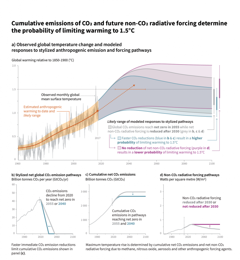
Figure SPM.1
Panel a: Observed monthly global mean surface temperature (GMST, grey line up to 2017, from the HadCRUT4, GISTEMP, Cowtan–Way, and NOAA datasets) change and estimated anthropogenic global warming (solid orange line up to 2017, with orange shading indicating assessed likely range). Orange dashed arrow and horizontal orange error bar show respectively the central estimate and likely range of the time at which 1.5°C is reached if the current rate of warming continues. The grey plume on the right of panel a shows the likely range of warming responses, computed with a simple climate model, to a stylized pathway (hypothetical future) in which net CO2 emissions (grey line in panels b and c) decline in a straight line from 2020 to reach net zero in 2055 and net non-CO2 radiative forcing (grey line in panel d) increases to 2030 and then declines. The blue plume in panel a) shows the response to faster CO2 emissions reductions (blue line in panel b), reaching net zero in 2040, reducing cumulative CO2 emissions (panel c). The purple plume shows the response to net CO2 emissions declining to zero in 2055, with net non-CO2 forcing remaining constant after 2030. The vertical error bars on right of panel a) show the likely ranges (thin lines) and central terciles (33rd – 66th percentiles, thick lines) of the estimated distribution of warming in 2100 under these three stylized pathways. Vertical dotted error bars in panels b, c and d show the likely range of historical annual and cumulative global net CO2 emissions in 2017 (data from the Global Carbon Project) and of net non-CO2 radiative forcing in 2011 from AR5, respectively. Vertical axes in panels c and d are scaled to represent approximately equal effects on GMST. {1.2.1, 1.2.3, 1.2.4, 2.3, Figure 1.2 and Chapter 1 Supplementary Material, Cross-Chapter Box 2 in Chapter 1}